I want an audience to remember "Golden Girl" because of the color scheme and flashbacks. I believe that both are elements that I specifically used and manipulated to further the comprehension of the theme and tone.
Overall, the golden color I used is seen across every aspect of the project. Using the gold color with the Crime/Psychological thriller genre is a bold choice, as normally darker colors are used to mirror the tone. I think that the contrast between tone and color scheme develops a really solid foundation for how people learn about the movie. All aspects use gold toning and gold fonts. The titling is uniform throughout each aspect, as I wanted the audience to be able to recall an “image” of some kind when the name of the film is announced around them. The film’s flashbacks all feature a gold filter with a dirty film overlay. The purpose of this was to exemplify Sephone’s experience being kidnapped. The gold color and dirt overlay on the film looks pleasant, reminding the audience of a good memory or one from their childhood. However, the content actually being shown is meant to disturb. The point of this was to juxtapose the horror of the event with the gratification Hader gets from kidnapping Sephone. The audience is receiving mixed signals through the editing. I think that the consistency of this element will connect the audience’s memory to something memorable from the film.
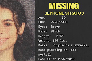
RESOURCES:
No comments:
Post a Comment